We just revamped the user interface of our GitHub App to make reviewing pull requests with our programming language aware diff simpler and more efficient. This blog post gives an overview of the changes to help you get the most out of it.
Marking files as reviewed
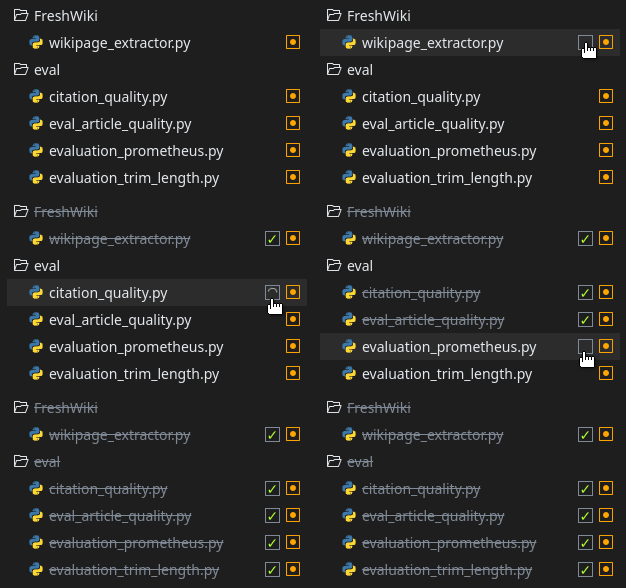
When reviewing code, you often need to jump between files to get the full picture. This requires keeping in mind which files you have already reviewed or you may end up reviewing a piece of code multiple times.
To help you with this, you can now mark files as reviewed. Simply check or uncheck the box that appears when hovering over a file. This information is only visible to you, so multiple reviewers all have their own review status.
Thread List
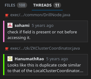
It is easy to lose track of review comments when working with large pull requests. The discussion page provides very little code context, and manually clicking through all the files is a bit error-prone, and you might miss a comment.
To make things easier, we added a Threads tab, which lists all the review threads for the currently selected commit (or all changes) next to the code. Just click on a thread’s preview to jump directly to that location in the code. You can also see whether a thread is marked as pending (or has pending comments), whether it has been resolved, and how many replies it has.
New Minimap
Our SemanticDiff GitHub App has had a minimap since its initial release, but it was limited to showing which parts of the file were added or removed.
This update brings a new minimap that is a true thumbnail of the changes, including a rendering of the code. This should help you better match the actual changes with the minimap, and make it easier to work with large files.
If you prefer the old, more minimal, minimap style, you can switch back to it using the newly introduced settings dialog (see below).
More Diff options/commands
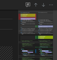
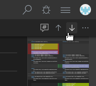
This update brings a few more options to help you efficiently navigate a diff. We added a toolbar above the code that provides buttons to easily jump between individual changes within a file. We also moved the toggle button to ignore changes within code comments here as well.
The dropdown menu gives you further control over the displayed context. You can expand all context lines or collapse them again.
Collapsible Sidebar / Minimap
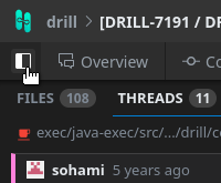
Reviewing files with long lines using a side-by-side diff can be a bit cumbersome when all the lines need to be wrapped. You can now give the code more space by collapsing the sidebar and/or minimap. Press CTRL+B (⌘+B on macOS) to control the visibility of the sidebar and CTRL+M (⌘+J on macOS) can be used to toggle the minimap.
The sidebar can also be hidden by clicking the sidebar icon at the beginning of the tabbar next to the tabs.
New settings
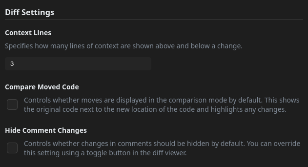
Besides changing options on-demand, you can now also configure their default values. Just click on your avatar and select “Settings” to open the dialog with the config options.
New Bug Report Option
Computing a semantic diff is a complex process consisting of many steps that all come with their own challenges. Even though we are constantly improving our algorithms and features, you may come across a diff that could be improved. To make it easier to report such cases, you can now submit a private bug report using the bug icon in the top right corner.
This is particularly useful for private repositories as it allows you to attach the diff of the currently viewed file without transmitting it via other, potentially less secure, channels. You can also use this interface to file bug reports without attaching any code to report issues not related to the diff.
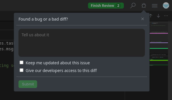
Image Diff
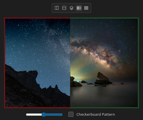
We have not only improved our code diff, but also added a completely new diff mode: Image Diffs. You can now compare images using a slider in overlay mode or by displaying them next to each other.
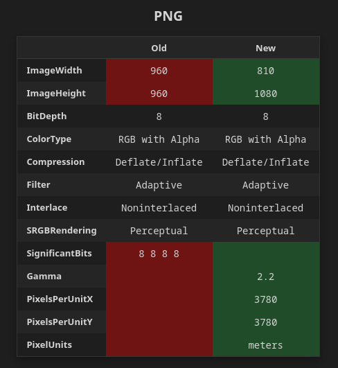
Unlike the GitHub image diff, Semanticdiff lets you compare the metadata of the images as well. This helps you catch any potential metadata that you don’t want to become part of your website or software. Or maybe you just want to check if an image uses a color palette or the correct color profile.
Overall Design
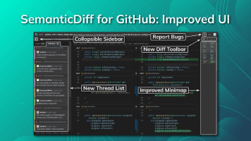
Integrating all these changes into our pull request interface required adjusting several parts of the design. Here is a screenshot of what the complete user interface looks like now:
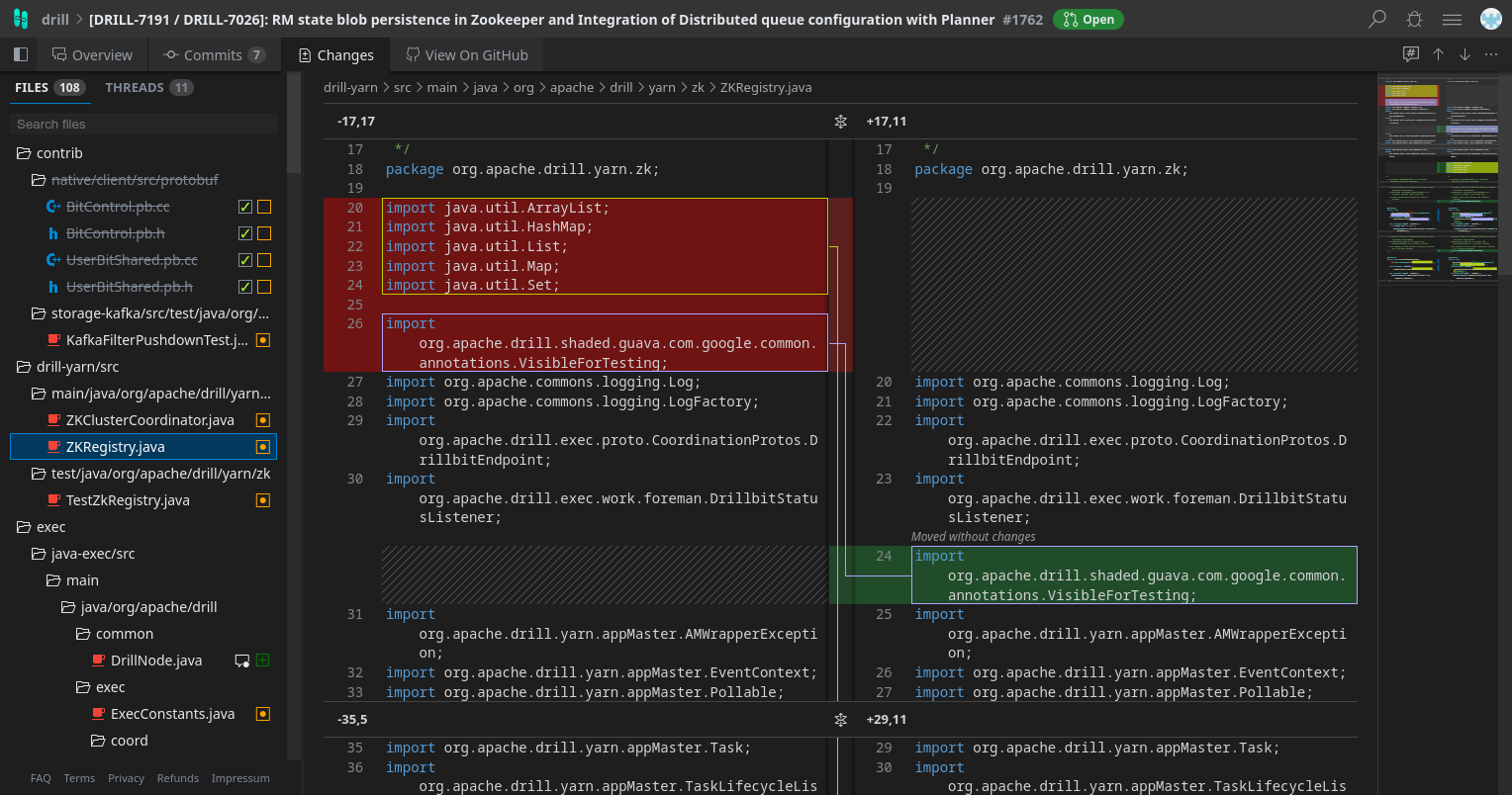
We also made some minor improvements to other parts of the user interface. You can now see which repositories are associated with a GitHub App installation and reach the options for installations with a paid subscription more easily. Just select the Billing entry in the user dropdown menu. Finding a specific repository has also become easier using the new sorting options and pagination.
We hope these change help you review code even faster. If you encounter any issues, please let us know in our issue tracker.

